

Lesson 12 of 22
Task 1 worked examples
These are original practice tasks. The model reports demonstrate one effective selection and organisation; other accurate approaches are possible. Word counts refer to the model report alone and use a simple space-separated count.
Example A: changes over time
Practice task: The line graph shows annual visits to three museums in a city from 2010 to 2025. Summarise the main features and make relevant comparisons. Write at least 150 words.
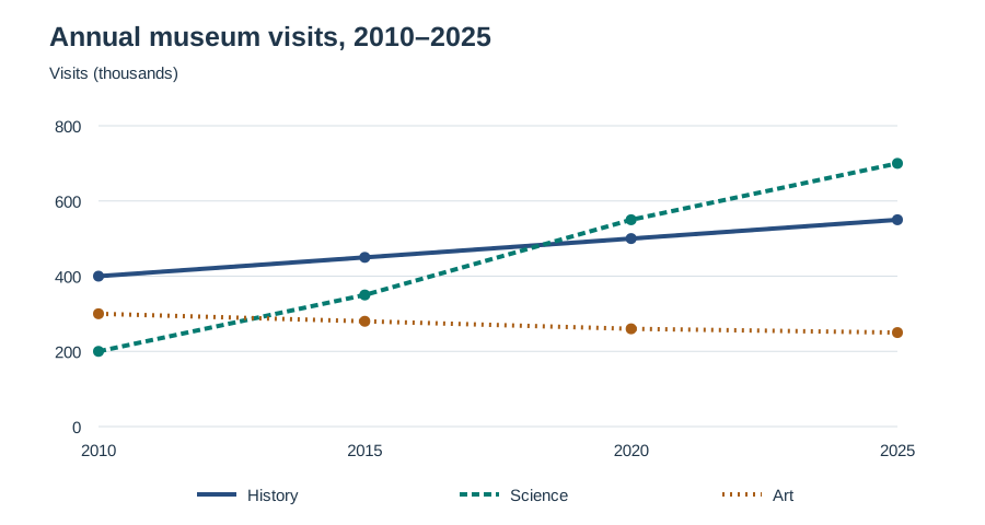
The underlying data are provided for accessible study:
| Year | History museum | Science museum | Art museum |
|---|---|---|---|
| 2010 | 400,000 | 200,000 | 300,000 |
| 2015 | 450,000 | 350,000 | 280,000 |
| 2020 | 500,000 | 550,000 | 260,000 |
| 2025 | 550,000 | 700,000 | 250,000 |
Plan: Overview: science records the largest rise and overtakes history; art declines. Details 1: history and science. Details 2: art and the changing gap.
Model report
The line graph compares annual visitor numbers at three city museums between 2010 and 2025.
Overall, attendance increased at the history and science museums, with the latter recording the strongest growth and becoming the most popular venue. By contrast, visits to the art museum declined throughout the period.
In 2010, the history museum attracted 400,000 visitors, twice the figure for the science museum. History museum attendance then rose steadily, reaching 450,000 in 2015 and 550,000 by 2025. Growth at the science museum was considerably greater. Its visitor numbers climbed to 350,000 in 2015 before reaching 550,000 in 2020, by which point it had overtaken the history museum. By the final year, it received 700,000 visits annually.
The art museum followed the opposite pattern. Starting at 300,000 visitors, its attendance fell to 280,000 in 2015 and then to 250,000 in 2025. Although it initially received 100,000 more visitors than the science museum, it finished the period with 450,000 fewer. It was also the least visited of the three museums from 2015 onwards.
Why it works: The overview reports direction and a ranking change. The body selects useful milestones and makes numerical comparisons. The figures do not explain why attendance changed, so the report does not speculate.
Example B: static comparisons
Practice task: The bar chart shows how households in three towns distributed their expenditure among four categories in 2024. Summarise the main features and make relevant comparisons. Write at least 150 words.
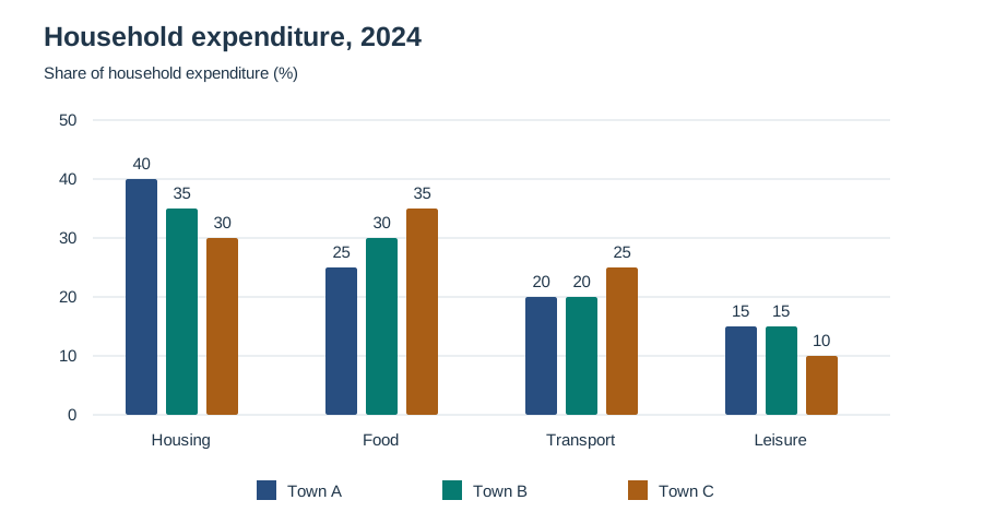
| Category | Town A | Town B | Town C |
|---|---|---|---|
| Housing | 40% | 35% | 30% |
| Food | 25% | 30% | 35% |
| Transport | 20% | 20% | 25% |
| Leisure | 15% | 15% | 10% |
Model report
The bar chart compares the proportions of household expenditure allocated to housing, food, transport, and leisure in three towns in 2024.
Overall, housing represented the largest expense in Towns A and B, whereas food accounted for the greatest share in Town C. Leisure received the smallest allocation in all three locations.
Housing took up 40% of household budgets in Town A, compared with 35% in Town B and 30% in Town C. The pattern for food was reversed: its share was lowest in Town A, at 25%, and highest in Town C, at 35%. Town B occupied the middle position, with food representing 30% of total spending. Together, these two categories accounted for 65% of expenditure in each town.
Transport made up one fifth of spending in both Town A and Town B, while the proportion in Town C was slightly higher, at 25%. Leisure represented 15% in each of the first two towns but only 10% in Town C. Consequently, Town C allocated a greater share to transport than either of the other towns, while spending a smaller proportion on leisure.
Why it works: The response groups related categories, notices a shared combined proportion, and uses comparison language. It does not describe increases or decreases because the chart presents one year.
Example C: maps
Practice task: The plans show Riverside Square in 2005 and 2025. Summarise the main changes and make relevant comparisons. Write at least 150 words.
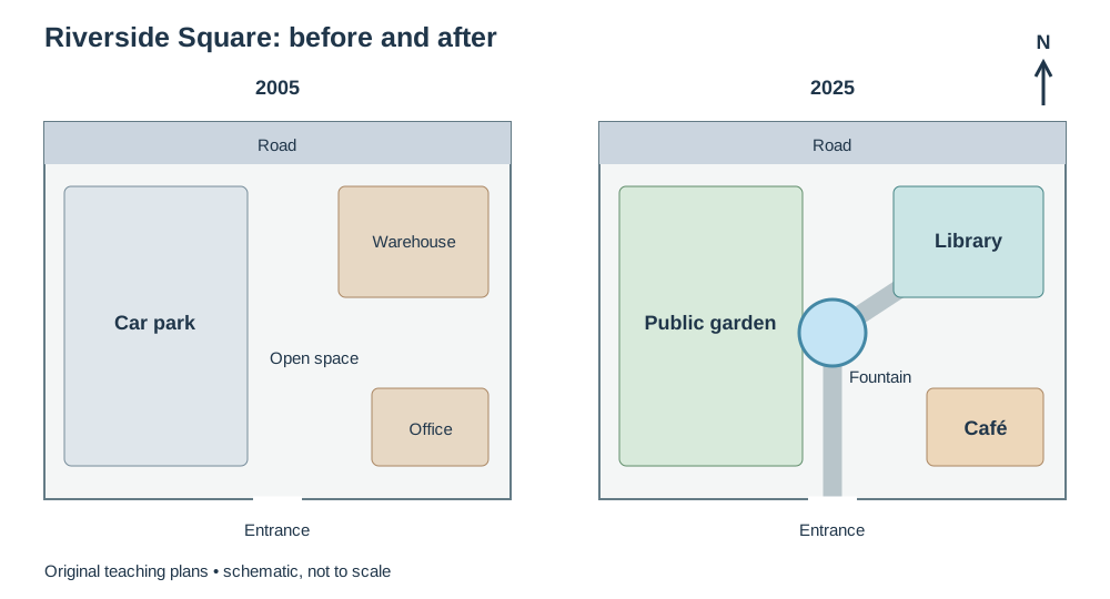
Accessible plan description: North is at the top. In both years, a road forms the northern boundary and an entrance stands at the centre of the southern boundary. In 2005, the western half is a car park; the northeastern corner contains a warehouse; the southeastern corner contains a small office; and the centre is open paved space. In 2025, the car park is a public garden, the warehouse site is occupied by a library, and the former office has been converted into a café. A circular fountain has been added in the centre. A new path links the entrance, fountain, and library.
Model report
The two plans illustrate the layout of Riverside Square in 2005 and the changes that had taken place by 2025.
Overall, the square was transformed from an area containing parking and commercial buildings into a space with public and leisure facilities. The northern road and southern entrance remained in their original positions.
In 2005, a car park occupied the western half of the site, while a warehouse stood in the northeastern corner. By 2025, the parking area had been replaced by a public garden. The warehouse was also removed, and a library was built on its former site. These changes introduced substantial areas for recreation and public use on both sides of the square.
The small office in the southeastern corner was converted into a café. Meanwhile, a circular fountain was installed in the previously open central area. A new path connected the southern entrance to the fountain and continued towards the library in the northeast. Although the uses of the interior changed considerably, access to the square remained through the same entrance on its southern boundary.
Why it works: The report describes major redevelopment, states what remained, locates the changes, and uses past tenses because both dates are completed past dates. It makes no claims about the planners' intentions.
Example D: a manufacturing process
Practice task: The diagram shows how used glass containers are made into new containers. Summarise the process. Write at least 150 words.
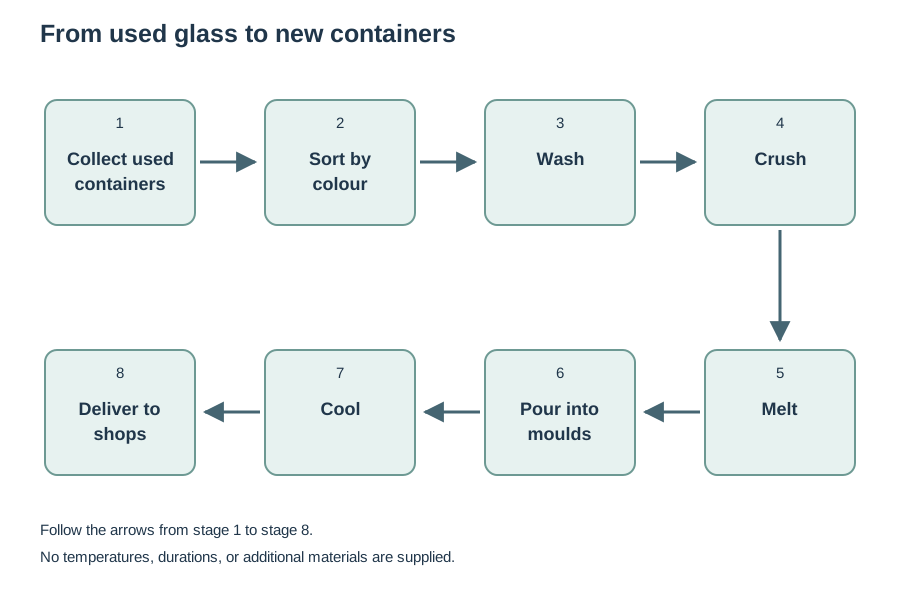
Accessible sequence: Used containers are collected, sorted by colour, washed, crushed, melted, poured into moulds, cooled, and delivered to shops. The diagram gives no temperatures, durations, or additional materials.
Model report
The diagram illustrates the stages involved in turning used glass containers into new products for delivery to shops.
Overall, this is a linear sequence that begins with the collection of discarded containers and ends with the distribution of newly manufactured ones. The glass is prepared before being melted, shaped, and cooled.
At the beginning of the process, used containers are collected and sorted according to their colour. The separated glass is then washed before it is crushed into small pieces. These stages prepare the recovered material for the transformation that follows. Once crushing has been completed, the fragments move to the melting stage, where they become liquid glass.
The molten glass is subsequently poured into moulds, which give the new containers their shape. After moulding, the containers are allowed to cool. The finished products are then delivered to shops, completing the sequence shown in the diagram. Thus, the initial stages deal with preparing the used material, while the later stages involve creating and distributing the new containers.
Why it works: All the supplied stages appear in order. The report groups preparation and remanufacturing, uses accurate passive forms, and avoids invented technical details. It describes the sequence shown as linear; it does not add an unshown loop from shops back to collection.
Example E: two related tables
Practice task: The tables show the numbers of students enrolled on three courses in 2024 and the percentages of the same students who completed their courses in 2025. Summarise the main features and make relevant comparisons. Write at least 150 words.
| Course | Enrolment in 2024 |
|---|---|
| Design | 500 |
| Computing | 800 |
| Business | 600 |
| Course | Completion rate in 2025 |
|---|---|
| Design | 82% |
| Computing | 75% |
| Business | 90% |
Model report
The tables compare enrolment on three courses in 2024 and the proportions of those students who completed their studies in 2025.
Overall, computing attracted the largest intake but recorded the lowest completion rate. Business had the highest completion rate, while design enrolled the fewest students.
Computing had 800 students, making it the largest of the three courses. Business enrolled 600, which was 200 fewer than computing but 100 more than design. With 500 students, design accounted for the smallest intake. The difference between the largest and smallest courses was therefore 300 students, and computing's enrolment was 60% higher than design's.
The ranking changed when completion rates were considered. Business led at 90%, followed by design at 82%. Computing recorded a rate of 75%, a gap of 15 percentage points below business. Although computing had the largest number of entrants, it was the only course on which just three quarters of the original cohort completed their studies. Design, despite its smaller intake, achieved a higher completion rate than computing.
Why it works: Both tables receive attention. The overview links them without confusing enrolment numbers and completion percentages. The comparison is descriptive and does not claim that larger classes caused lower completion.